 Canada
Canada
Canada
Case study · Packaging & brand
Home fragrance & bath for the American lifestyle house — a foil-stamped vintage-floral system across candles, bath and body, built for North American retail and gifting.
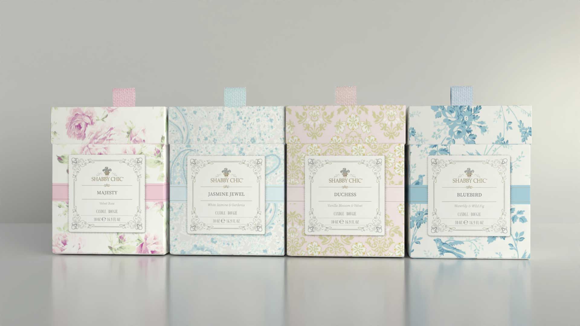
Carry the Shabby Chic world — the vintage, romantic, faded-floral look the house gave its name to — out of bedding and interiors and onto a candle box and a hand-cream tube, without losing an ounce of it.
Not a published brief. Tasarist has not published a written brief for this program, so the ask above is reconstructed from the work itself and from the Shabby Chic brand record (shabbychic.com) — it is the problem the design solves, not a quotation. Confirm the real brief with the client before this ships.
Shabby Chic® is Rachel Ashwell's American lifestyle house — the studio that gave the vintage, romantic, faded-floral look its name (est. 1989). Extending that world into home fragrance and bath meant carrying a bedding-and-interiors sensibility onto a candle box and a hand-cream tube without losing an ounce of it.
Tasarist built a full packaging and identity system: a distinct vintage-floral pattern and colourway for each scent — Majesty (Velvet Rose), Jasmine Jewel, Duchess and Bluebird — held together by an ornate, foil-stamped cartouche label and the Shabby Chic crest. Silk-ribbon pull boxes, bilingual EN/FR copy and gift-ready structures make each piece read as a present before it is opened.
The result is a range that behaves like the brand: quiet luxury, hand-finished detail, and shelf presence that reads from across the aisle.
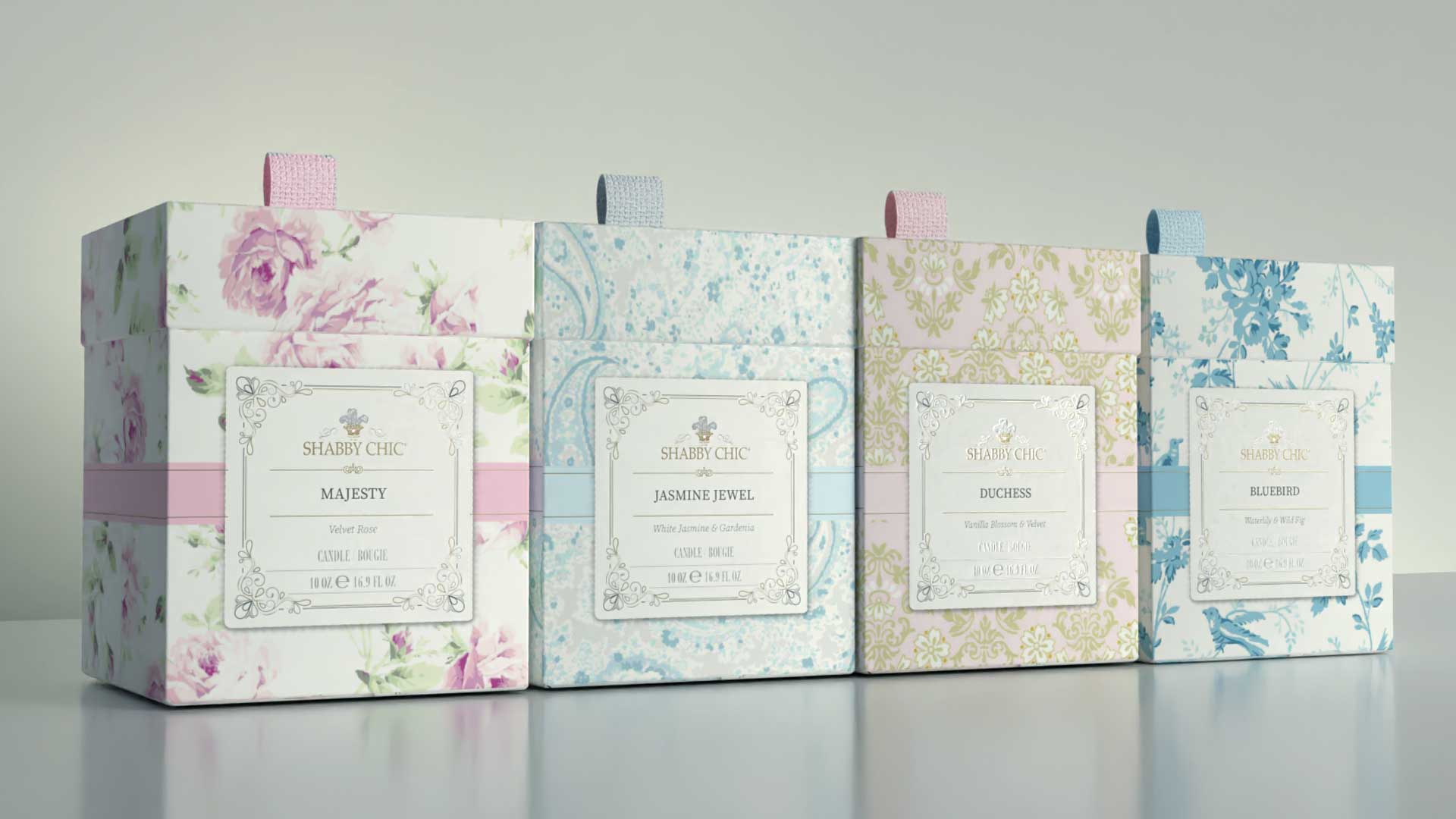
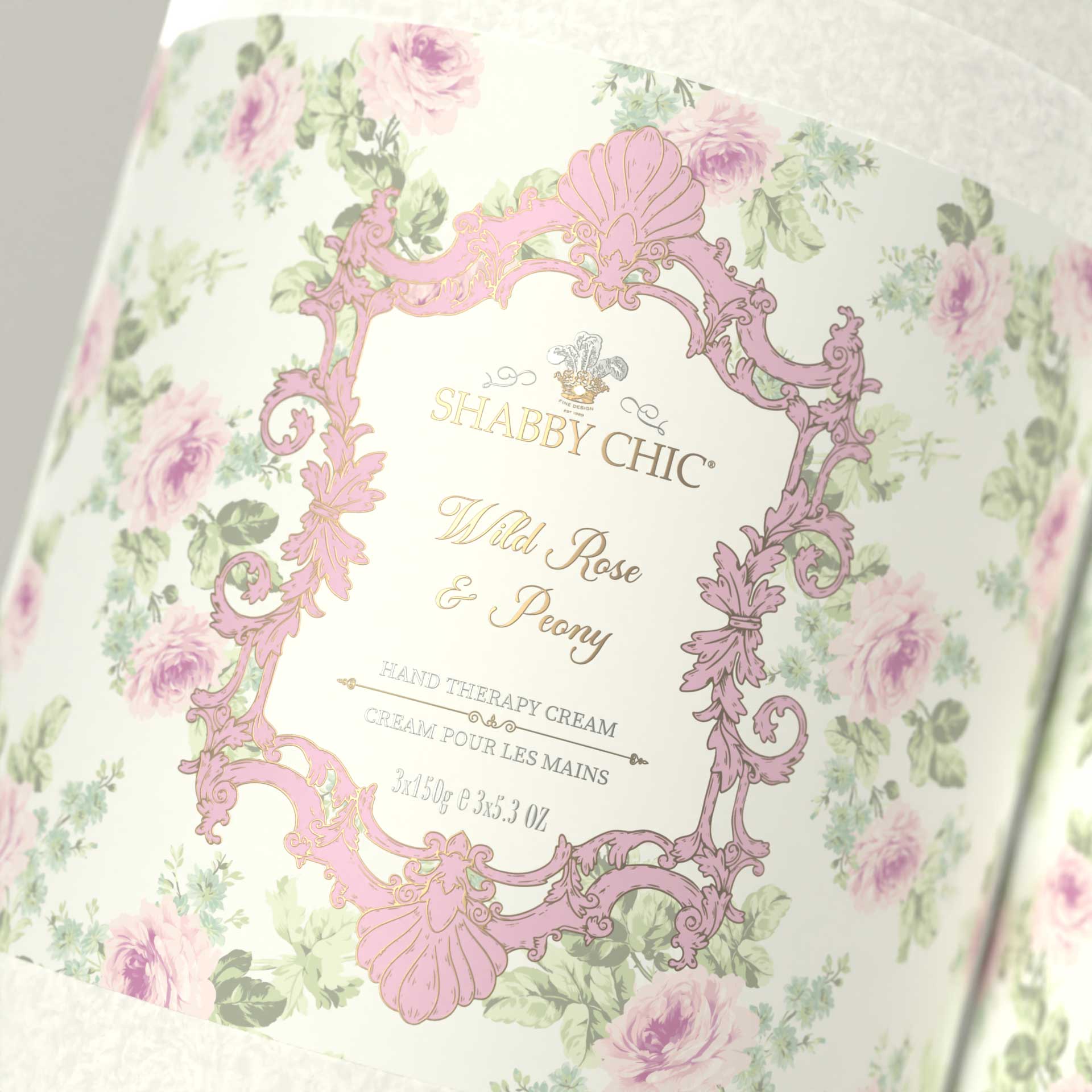
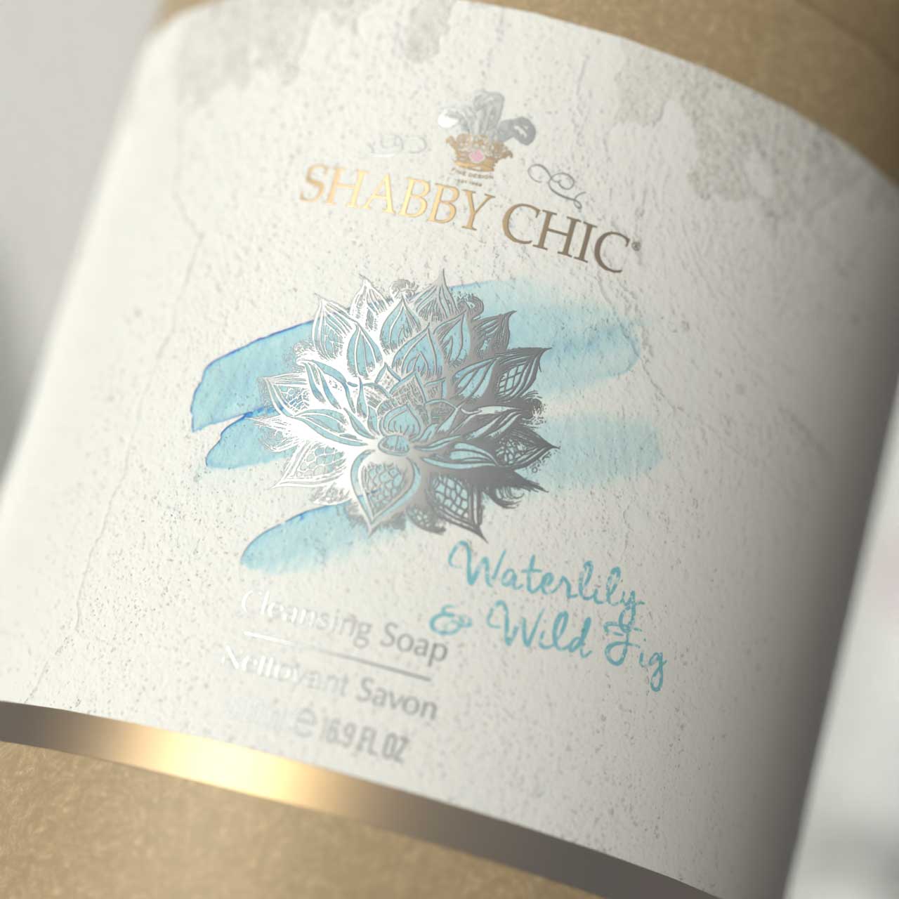
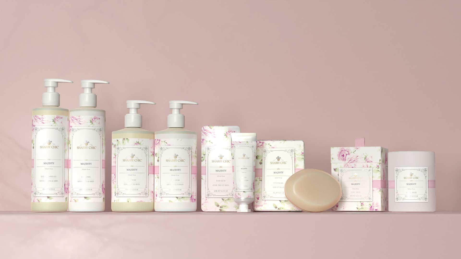
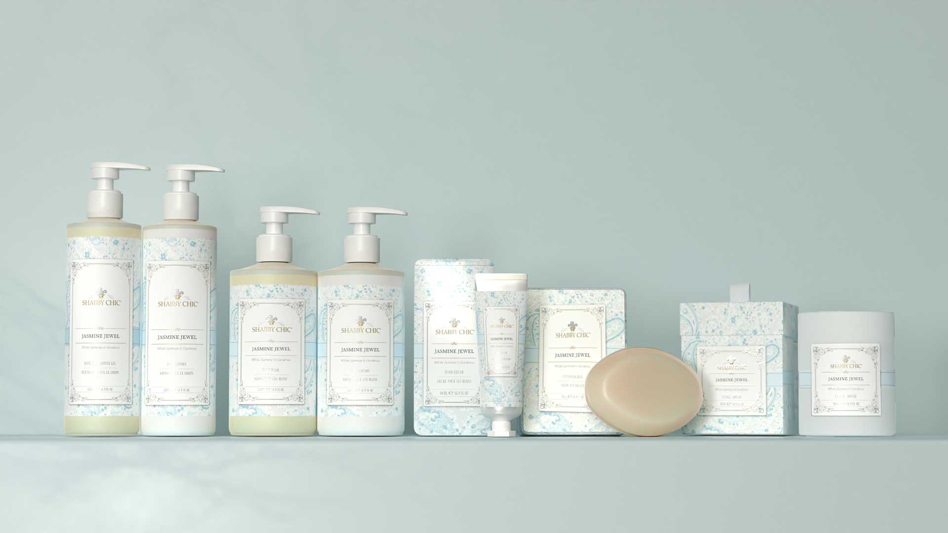
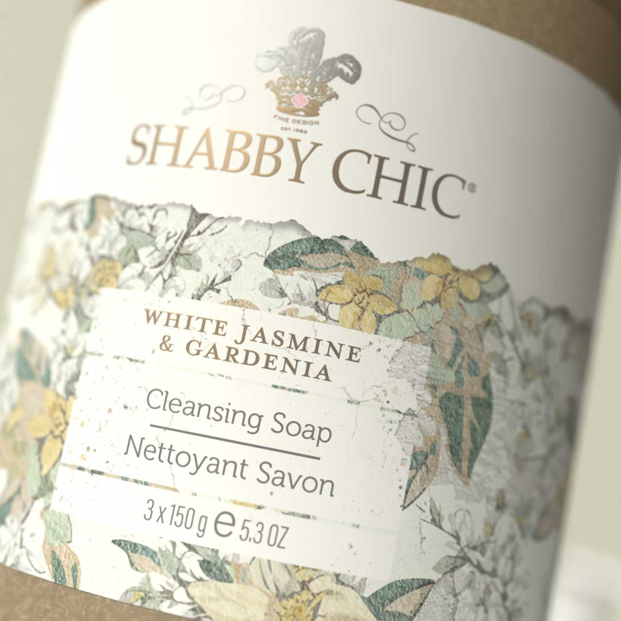
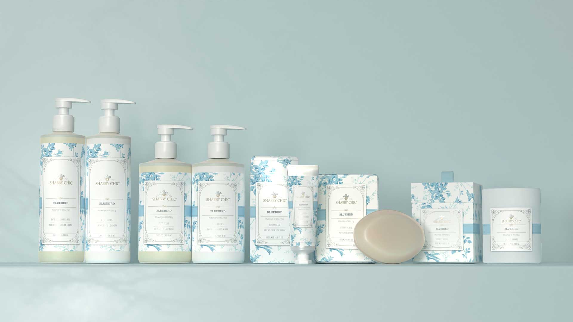
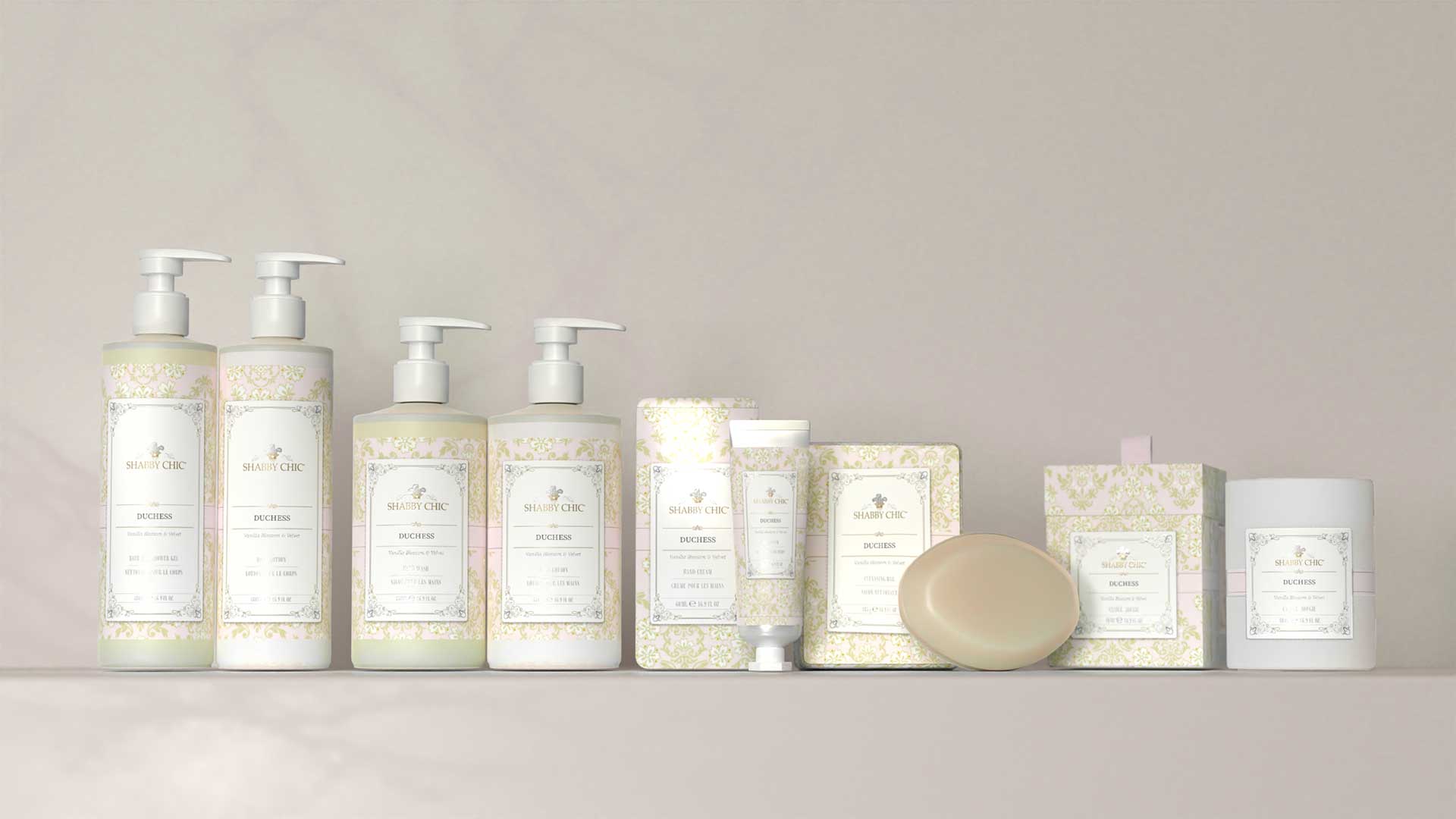
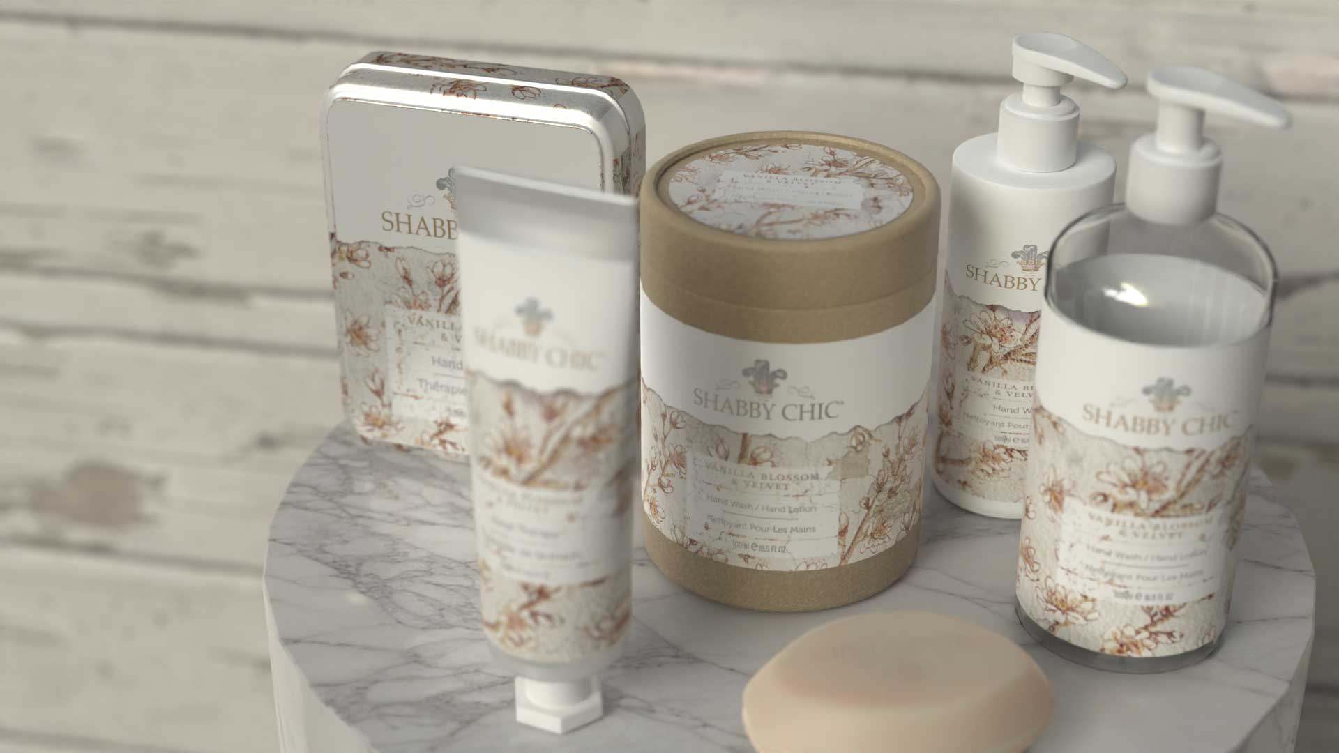
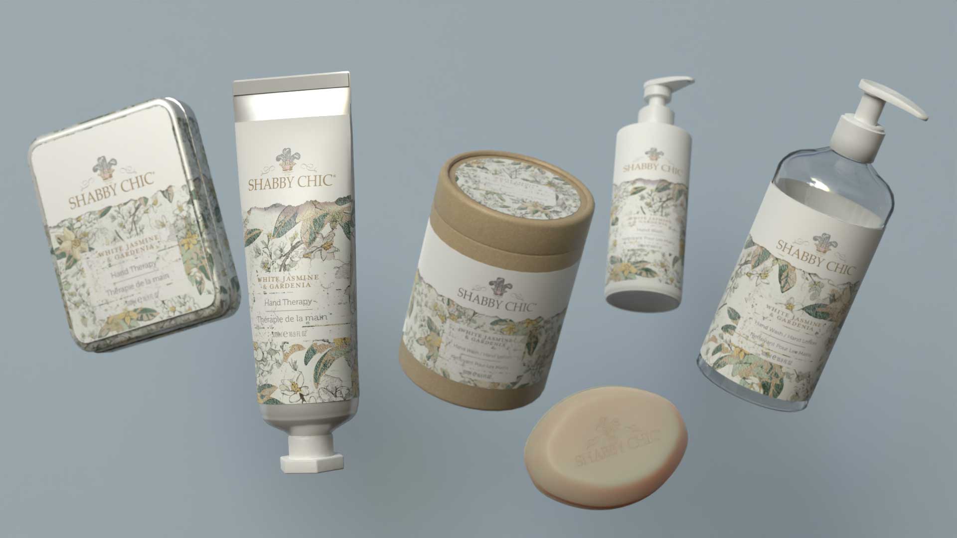
Packaging & brand design program for Shabby Chic. Images are the studio's own renders and are shown as design work; brand marks belong to their owner.